Art worth leaving out.
Give each journal an illustrated world of its own. The cover should help someone recognize their moment before they read a description. Tie the collection together through artistry, not a repeated symbol on a plain cover.
A BRAND FOR A WHOLE LIFE
A Little Longer is a keepsake brand built around the people and moments we wish we could hold onto. The journals are its first expression.
The identity should feel personal, expressive and collected over time. The ribbon-book emblem connects a written story with a meaningful gift. A confident serif wordmark gives it an editorial character.
Download the logo concept ↗01 / THE SELECTED PALETTE
Daylight is our selected direction: slate blue and cream, with pale blue and soft peach accents. It gives the brand a fresh, open feeling throughout the year. Each journal retains its own illustrated cover colors.
02 / THREE COLORWAYS TO CONSIDER
Colorway 03, Daylight, is selected and applied to the storefront. Heirloom and Botanical remain here as earlier palette explorations.
01 · HEIRLOOM / EXPLORATION
02 · BOTANICAL / QUIET & GROUNDED
03 · DAYLIGHT / SELECTED
03 / THE CREATIVE RULES
Give each journal an illustrated world of its own. The cover should help someone recognize their moment before they read a description. Tie the collection together through artistry, not a repeated symbol on a plain cover.
Warm, specific and conversational. “What did they say that made you laugh?” Give people a useful invitation. Leave room for joy, ordinary life and complicated feelings.
Show the book beautifully. Show real pages. Then make the format, price and delivery information easy to find. Use honest details to earn confidence; add customer stories only when we have them.
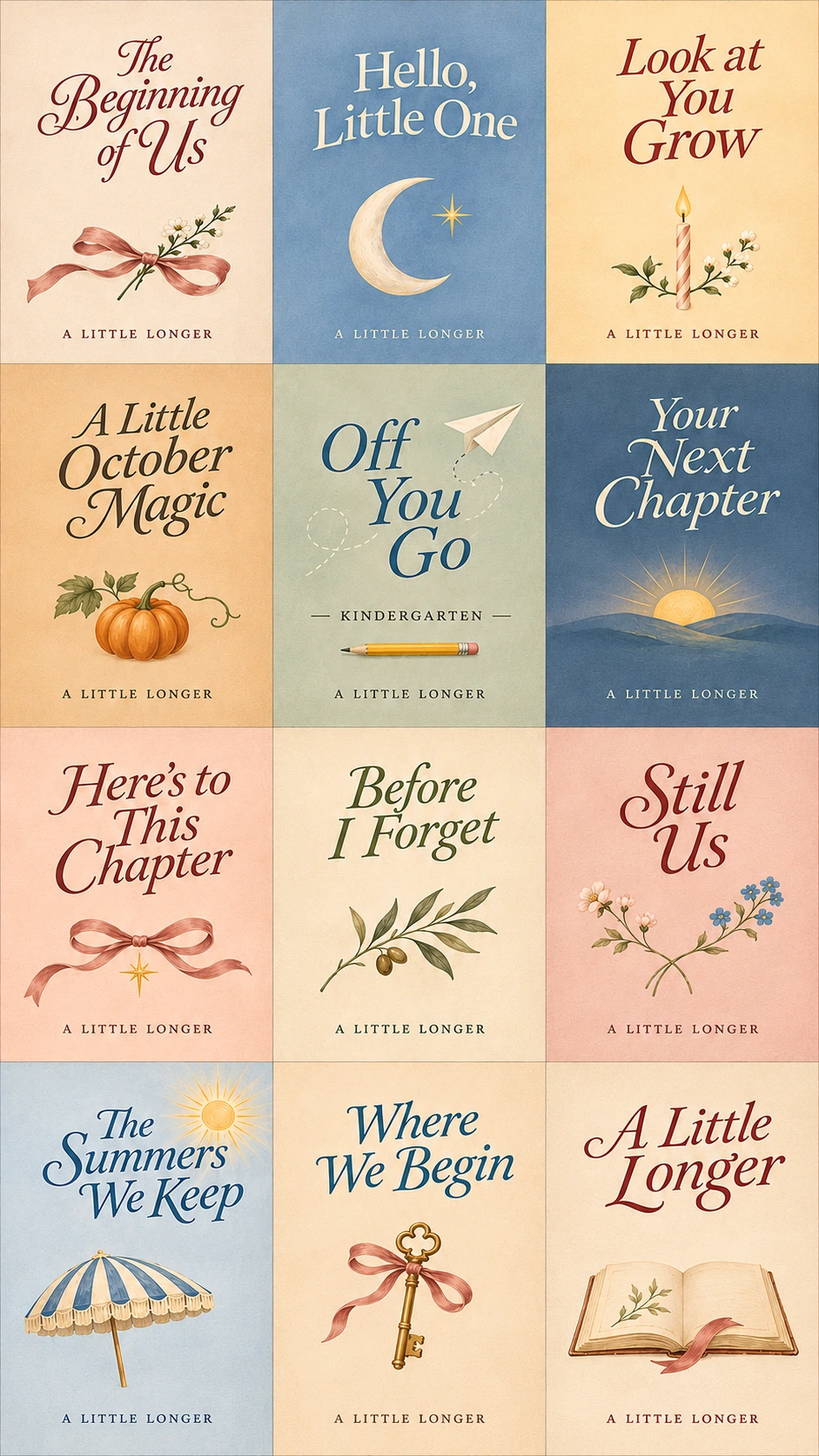
Cover concepts for the new collection. The established fireside Dear December cover is preserved separately. Logo concept requires final vector artwork and small-size refinement before production packaging.